

File:OIF fatalities by month.png
| This graph image was uploaded in a raster graphics format such as PNG, GIF, or JPEG. However, it contains information that could be stored more efficiently and/or accurately in the SVG format, as a vector graphic. If possible, please upload an SVG version of this image. After confirming it is of comparable quality, please replace all instances of the previous version throughout Wikipedia (noted under the "File links" header), tag the old version with |
 |
Summary
| Description |
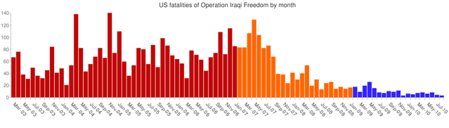
A bar graph showing the complete US fatalities from Operation Iraqi Freedom by month, from beginning to end. Based on this Google Chart API graph, with further editing in Photoshop. The red months are pre- troop surge, the orange months are post-troop surge, and the blue months are under Obama. Although overall month-on-month figures have decreased, the total level of coalition forces has also reduced. There are no labels on the X-axis because Google Chart API did not allow me to add them properly. If anyone would like to add them it would help. |
|---|---|
| Source |
Graph entirely my own work, statistics provided by iCasualties. |
| Date |
20 September 2010 |
| Author |
Smurfy |
| Permission ( Reusing this file) |
See below. |
| Other versions |
 |
Licensing
 |
I, the copyright holder of this work, hereby release it into the public domain. This applies worldwide. If this is not legally possible: |
 |
This is a candidate to be copied to Wikimedia Commons. Freely licensed or public domain media are more accessible to other Wikimedia projects if placed on Commons. Any user may perform this move—please see Moving images to the Commons for more information. Please thoroughly review the copyright status of this file and ensure that it is actually eligible for transfer to Commons. If you are concerned that this file could have problems with its attribution information and/or copyright status, then remove this notice and DO NOT transfer it to Commons. By transferring this file to Commons, you acknowledge you have read this message and are willing to accept any and all consequences for inappropriate transfers. Repeat violators will be blocked from editing. If you have checked the file and it is OK to move to Commons add "|human=username" to the template so other users can see it has been checked and can help you copy the file to Commons. If the file can't be moved to Commons consider nominating the file for deletion or changing the template to {{NotMovedToCommons|reason=Why it can't be copied to Commons}} If this image has been copied to Commons replace this tag with {{subst:ncd}} or {{subst:ncd|Image name on Commons.ext}} if a different filename is used on Commons. Copy to Commons: via CommonsHelper |
||
|
|||
File usage
Metadata
Background information
Learning is fun and easy with Schools Wikipedia. SOS Childrens Villages helps those who have nothing and no one, giving them back the famly they have lost and bringing them the very best opportunities for a happy, healthy future. Help another child by taking out a sponsorship.